Responsive Event Examples
The "responsive" calendar format allows you to embed a calendar using an iFrame that automatically resizes to fit the available space in your website or browser. This type of calendar is optimized to fit any screen size, including smartphones.
You have control over everything in your embedded events including layouts, color coding, navigation styles, calendar features, and more.
You can embed a responsive calendar or you can choose to embed a responsive list of events (featured on this page). In the examples below, we show you sample calendars and how you can take advantage of the unique features of our responsive events.
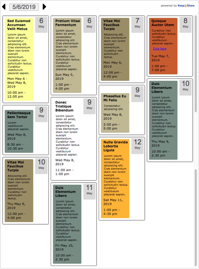
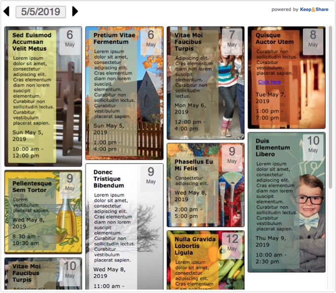
Style: Tall — date box
This is the "Tall — date box" view without images.
Example:
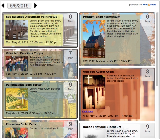
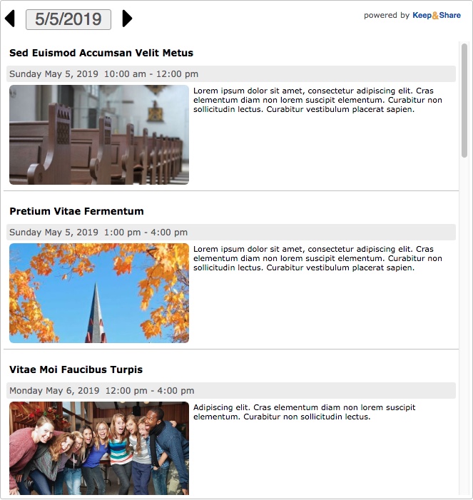
This is the "Tall — date box" view with images.
Example:
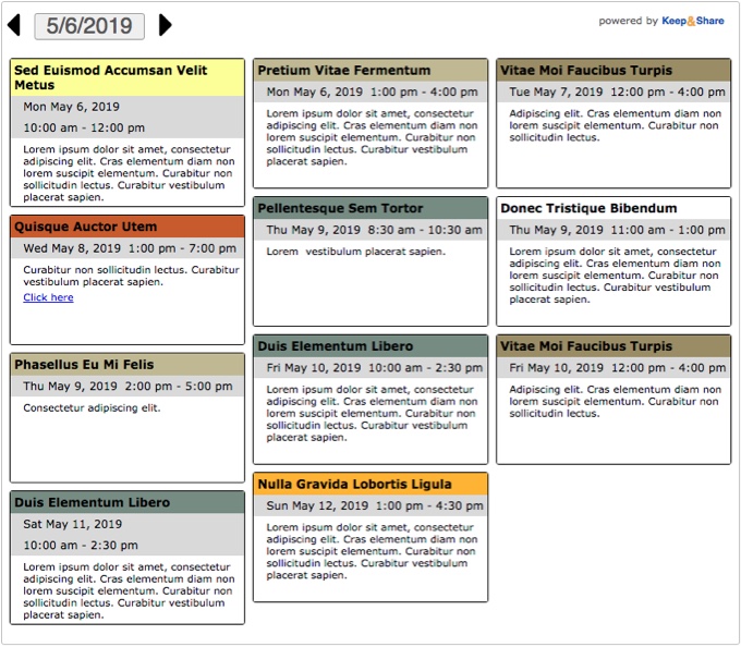
Style: Wide — date box
This is the "Wide - date box" view without images.
Example:
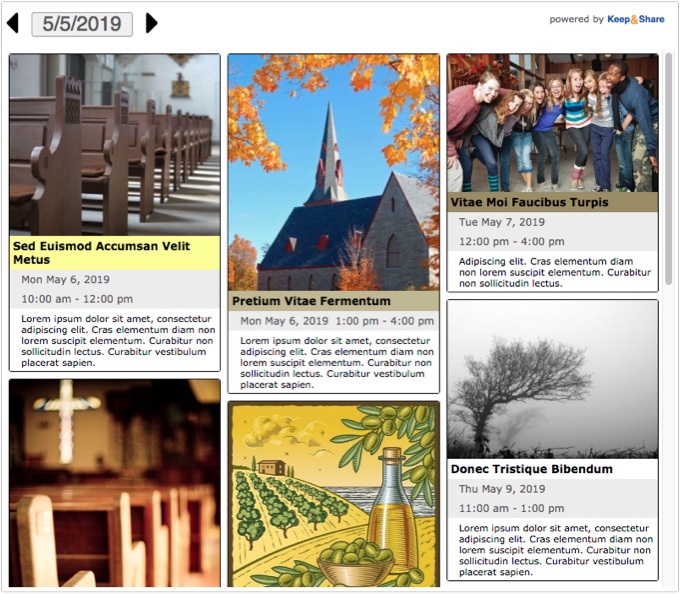
This is the "Wide — date box" view with images.
Example:
Below is a "Wide — date box" embedded events but with the "Fade Background option in the "Display" tab turned on. The "Fade Background" feature is available to all responsive event views.
Example:
You can tell that the "Fade Background" feature has been turned on in your embedded events when you see the code highlighted below:
HTML Example:
<iframe allowTransparency="true" src="https://www.keepandshare.com/calendar99/embed_calendar.php?i=2741513&style=x&layout=float&fmt=std&startdate=2019-05-05&soffset=0&n=5&rn=7&hc=ECECEC&htc=585858&navicon=caret&sr=y&sparse=y&shade=y&fsz=11&rw=460&rh=310&themeChoice=0&date=2019-05-05" width="100%" height="500" scrolling="no" frameborder="0"></iframe>
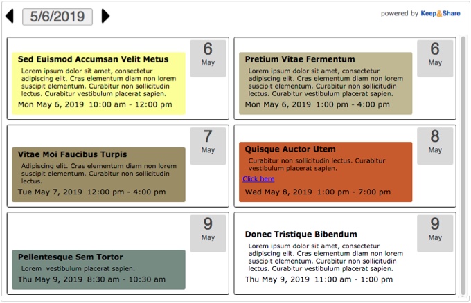
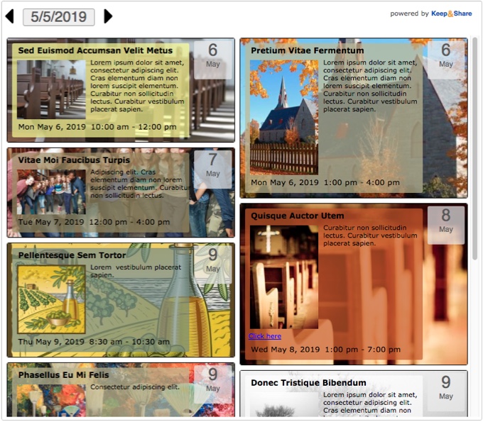
Style: Tall — date bar
This is the "Tall — date bar" view without images.
Example:
This is the "Tall — date bar" view with images.
Example:
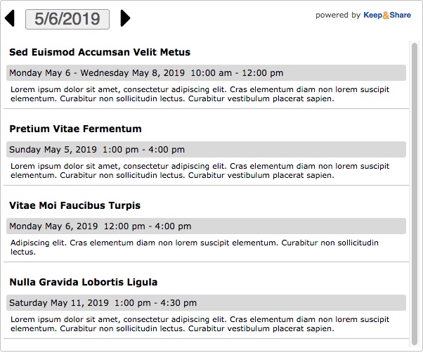
Style: Wide — date bar (list)
This is the "Wide — date bar (list)" view without images.
Example:
This is the "Wide — date bar (list)" view with images.
Example: