Responsive Calendar
The "Responsive" Calendar embedding option is a Calendar that will automatically resize itself depending on the size of the internet browser it is in. This means that your Calendar will look good on a computer, smart phone, or any other mobile device. If the website into which you are embedding is responsive and may be resized to very small window sizes such as a smart phone, then you should embed a Responsive Calendar into that website. This is so that your Calendar may also resize smaller and adjust to the small browser sizes.
Note: In order for an embedded responsive calendar to work, your website must also be responsive. If your website isn't responsive then your calendar will not resize accordingly. You can see if your website is responsive and adjusts for small devices (like phones) by using Google's Mobile-Friendly Test.
With the "Responsive" calendars you can choose from a variety of layouts. You can either display a calendar or just display a series of events. You can also make changes to colors, navigation style, and other visual details.
You will be able to preview these changes on the right side of your configuration screen or you will be able to click the "new window" icon on the right side of the text field next to "Link to Calendar" to see your Calendar in a new window.
Embedding Responsive Calendars
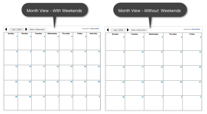
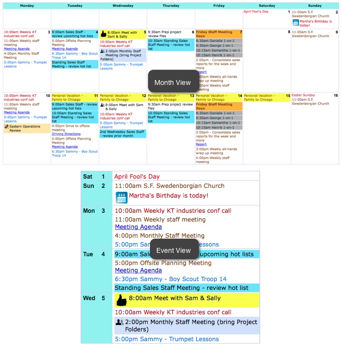
There are three types of full Responsive calendars that you can embed: Month, 4 Weeks, and Day Scroll. You can embed the "Month" view with weekends or without weekends. See below:
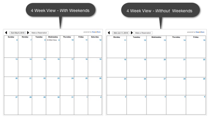
You can embed the "4 Weeks" layout with weekends or without weekends. See below:
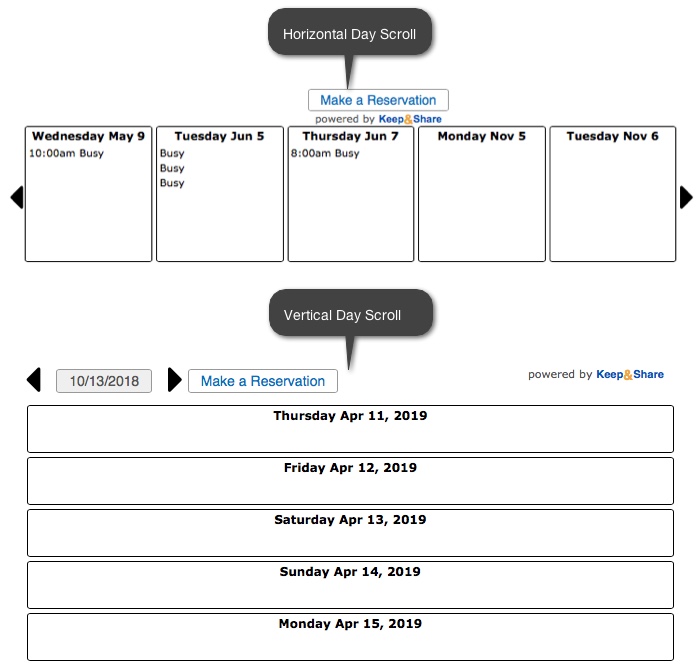
The Day Scroll is a highly customizable option to embed a compact, view-only display of your calendar on a website. You can control the number of days on display as well as the type of days on display by hiding days that are empty in content. You can embed a horizontal or vertical Day Scroll. See below:
Embedding Responsive Lists of Events
When you embed a responsive "Events" calendar each event in your calendar is displayed in an individual box in your calendar. This makes it easy to view each event and list upcoming events.
If you use a lot of images for events in your calendar the responsive "events" calendar is the best way to show off your photos.
Finding the embed code
First, make sure that your Calendar is Publicly Shared, otherwise your Calendar will not be available for display on your website without requiring web visitors to log into an approved Keep&Share account to view it. Then you will need to click on the gray "Customize" button above the Calendar that you want to embed. See the image below:
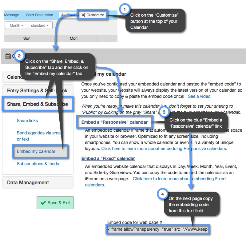
Once you are in the embedding editor screen, you can play around with different options and layouts for your Calendar on the left-hand side of the screen and previewing the results on the right-hand side of the screen. If you’re curious what a feature does, just hover your mouse over the blue links to read more about each option available.
After you have copied your Responsive Calendar embed code, it will look similar to this:
HTML Example:
<iframe allowTransparency="true" src="http://www.keepandshare.com/calendar13/embed_calendar.php?i=533&style=r&fmt=std&startdate=&n=7&h=&w=&dbc=&hc=&htc=&tbc=&tbtc=<c=&ntc=&navicon=caret&fsz=11&nav=y&ac=y&sparse=n&lang=&ifr=y&frw=&frh=&frs=no" width="100%" height="100%" scrolling="no" frameborder="0"></iframe>
Adjusting the height/width of Responsive Calendars
This copied iFrame code will go into the body of your page. You will see in the iFrame code that there is a place where you can choose the width and height of your responsive calendar (highlighted in yellow). Set the height of your responsive calendar to whatever you choose. The height can be a percentage or an exact pixel height. It does not matter what height you choose as long as the width of the the embedded calendar is a percentage, so that the calendar will be responsive.
If the calendar does not behave correctly with a percentage (%) height, then switch to an exact pixel (px) height to lock the height of the calendar.
The width should usually be set to 100% because that means 100% of the container element that the iframe is placed in. However, 80% or 50% or any other percentage would still make the calendar responsive.
If you don’t want the calendar to be responsive, but instead want to lock it to a certain size, then you would need to set both the height and the width to pixel values.
Calendar with percentage height and width:
<iframe allowTransparency="true" src="http://www.keepandshare.com/calendar13/embed_calendar.php?i=533&style=r&fmt=std&startdate=&n=7&h=&w=&dbc=&hc=&htc=&tbc=&tbtc=<c=&ntc=&navicon=caret&fsz=11&nav=y&ac=y&sparse=n&lang=&ifr=y&frw=&frh=&frs=no" width="100%" height="100%" scrolling="no" frameborder="0"></iframe>
Calendar with pixel height and percentage width:
<iframe allowTransparency="true" src="http://www.keepandshare.com/calendar13/embed_calendar.php?i=533&style=r&fmt=std&startdate=&n=7&h=&w=&dbc=&hc=&htc=&tbc=&tbtc=<c=&ntc=&navicon=caret&fsz=11&nav=y&ac=y&sparse=n&lang=&ifr=y&frw=&frh=&frs=no" width="100%" height="600px" scrolling="no" frameborder="0"></iframe>
Calendar with pixel height and pixel width:
<iframe allowTransparency="true" src="http://www.keepandshare.com/calendar13/embed_calendar.php?i=533&style=r&fmt=std&startdate=&n=7&h=&w=&dbc=&hc=&htc=&tbc=&tbtc=<c=&ntc=&navicon=caret&fsz=11&nav=y&ac=y&sparse=n&lang=&ifr=y&frw=&frh=&frs=no" width="800px" height="600px" scrolling="no" frameborder="0"></iframe>
The exception to the above rule is if you want to make a page that embeds only the <iframe> element, and you want it to take up the entire browser window in a responsive fashion, then you must add a <style> block to the <head> section of the page (highlighted below).
HTML Example:
<html>
<head>
<style>
html, body{
height:100%;
}
</style>
</head>
<body>
<iframe allowTransparency="true" src="http://www.keepandshare.com/calendar13/embed_calendar.php?i=533&style=r&fmt=std&startdate=&n=7&h=&w=&dbc=&hc=&htc=&tbc=&tbtc=<c=&ntc=&navicon=caret&fsz=11&nav=y&ac=y&sparse=n&lang=&ifr=y&frw=&frh=&frs=no" width="100%" height="100%" scrolling="no" frameborder="0"></iframe>
</body>
</html>
Once your Calendar is embedded into a webpage, it will automatically update to latest content in the Calendar on Keep&Share with every page refresh. To change the settings on how the Calendar is embedded however, you will need to paste in a new line of embed code to update those changes.
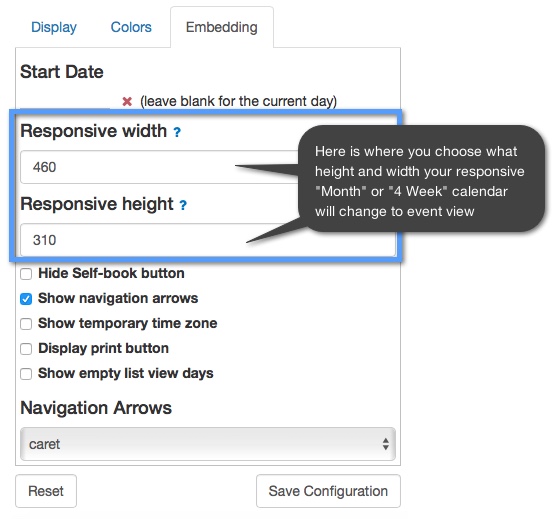
Changing the Calendar breakpoint
When your responsive "Month" or "4 Week" calendar gets small enough either horizontally or vertically, your calendar will change from month view to event view. This makes it easier for visitors to your embedded calendar to read your events in smaller browser windows.
The default breakpoints for when your responsive calendar changes to event view is when the calendar is smaller than 768 pixels in width and 461 pixels in height.
If these breakpoints are too large and you would like your calendar to not change to event view until it is smaller than these sizes, you can change this in your responsive calendar settings. Please note that you'll first need to select "Month" or "Week" as your calendar layout before you can change the calendar breakpoints.
First you will need to be on the responsive calendar configuration screen (the same screen where you copy the code for your calendar) See the image below: